Sifflet Design System
Lead Product Designer | Paris, FR
As Sifflet's founding Product Designer, I crafted our design system to bring UI consistency and efficiency to the team's work. I solely created the system's full library of styles, components, and UX writing guidelines.
Styles
The foundational styles—color, typography, spacing, and iconography—define the visual identity of Sifflet and are essential for consistency across the UI. These simplistic elements allow the design system to scale and support even the most complex component combinations.
1. 🔤 Typography
Sifflet uses the typeface DM Sans, a modern and minimalistic sans-serif font from Google. For technical writing, we use DM Mono which is the monospaced companion to DM Sans.
Display 2XL — 72px/90px - 5.123rem
DM Sans - 72px
Display XL — 60px/72px - 4.286rem
DM Sans - 60px
Display L — 48px/60px - 3.429rem
DM Sans - 48px
Display M — 32px/40px - 2.286rem
DM Sans - 32px
Display S — 24px/32px - 1.714rem
DM Sans - 24px
Text L — 16px/24px – 1.143rem
DM Sans - 16px
Text M — 14px/20px - 1.000rem
DM Sans - 14px
Text S — 12px/16px - .857rem
DM Sans - 12px
Text XS — 10px/12px - .714rem
DM Sans - 12px
Mono Display L — 48px/60px - 3.429rem
DM Mono - 48px
Mono Display S — 24px/32px - 1.714rem
DM Mono - 24px
Display L — 16px/24px – 1.143rem
DM Mono - 16px
Display M — 14px/20px - 1.000rem
DM Mono - 14px
Display S — 12px/16px - .857rem
DM Mono - 12px
2. 🎨 Colors
Color plays a central role in Sifflet’s identity and accessibility. To support flexible color theming, I implemented a system of color variables which abstracts raw color values. These variables are organized with semantic names reflecting their role in the UI.
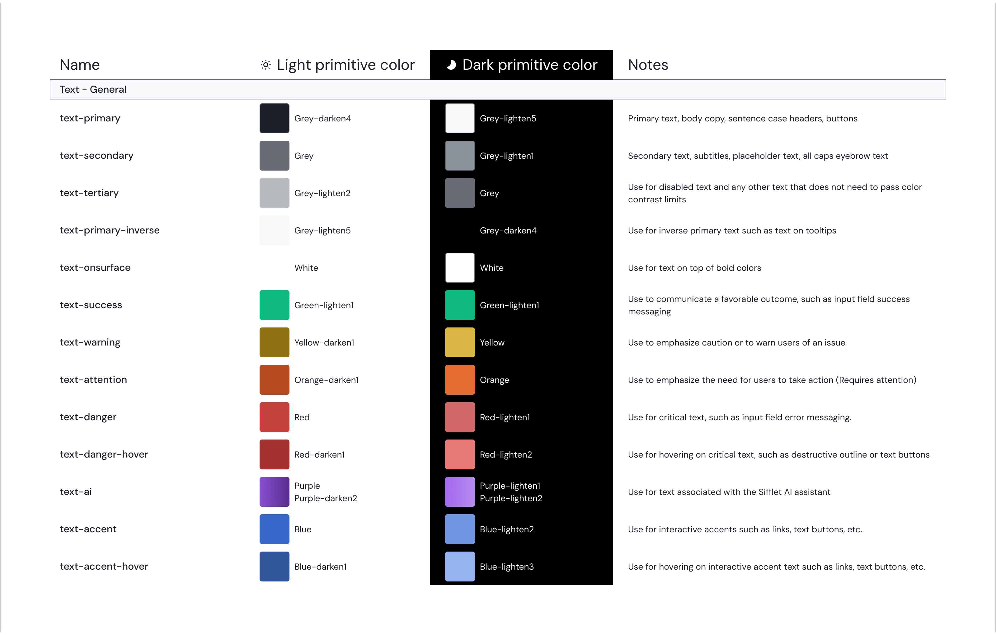
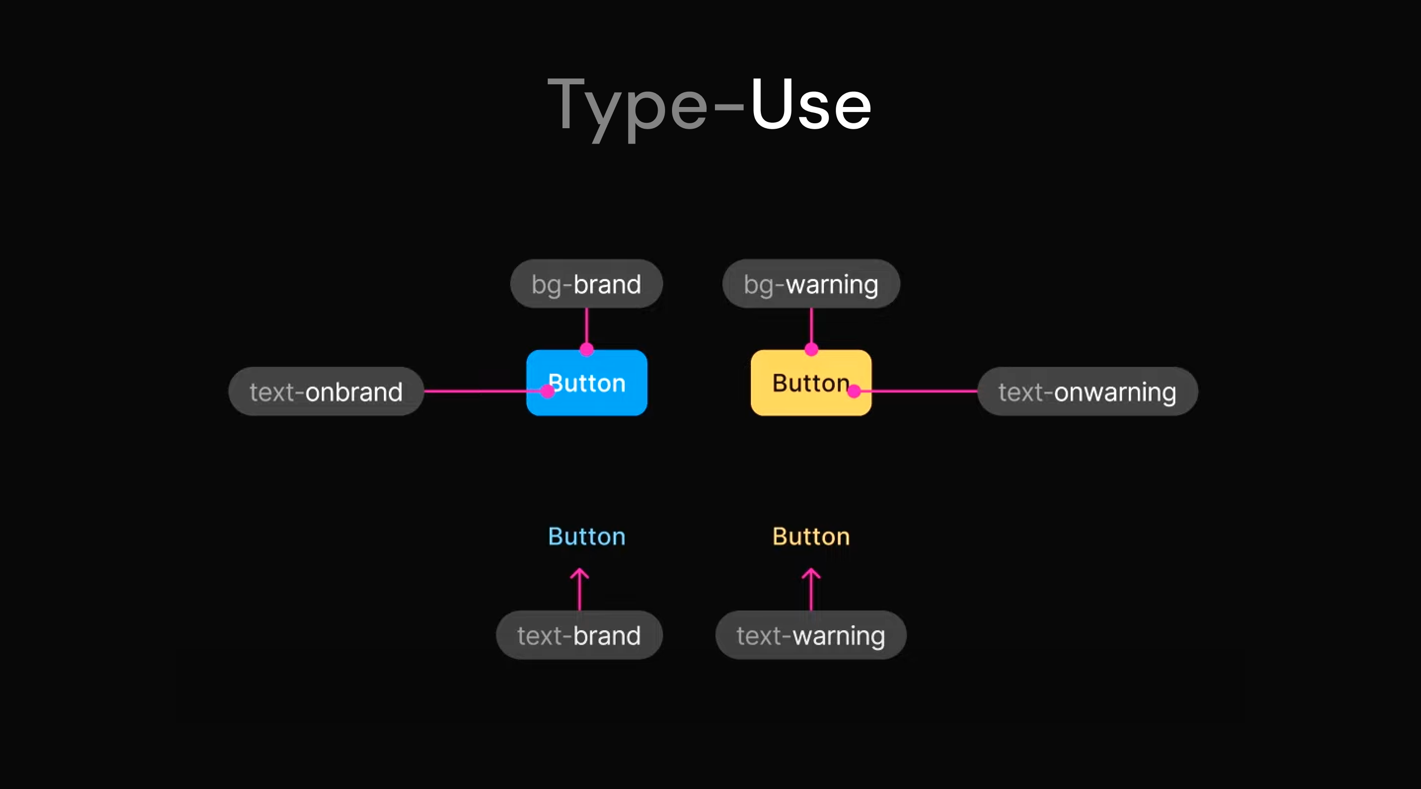
Color use (brand, warning, etc.) and its type (text, bg, etc.) give color variables their prefix
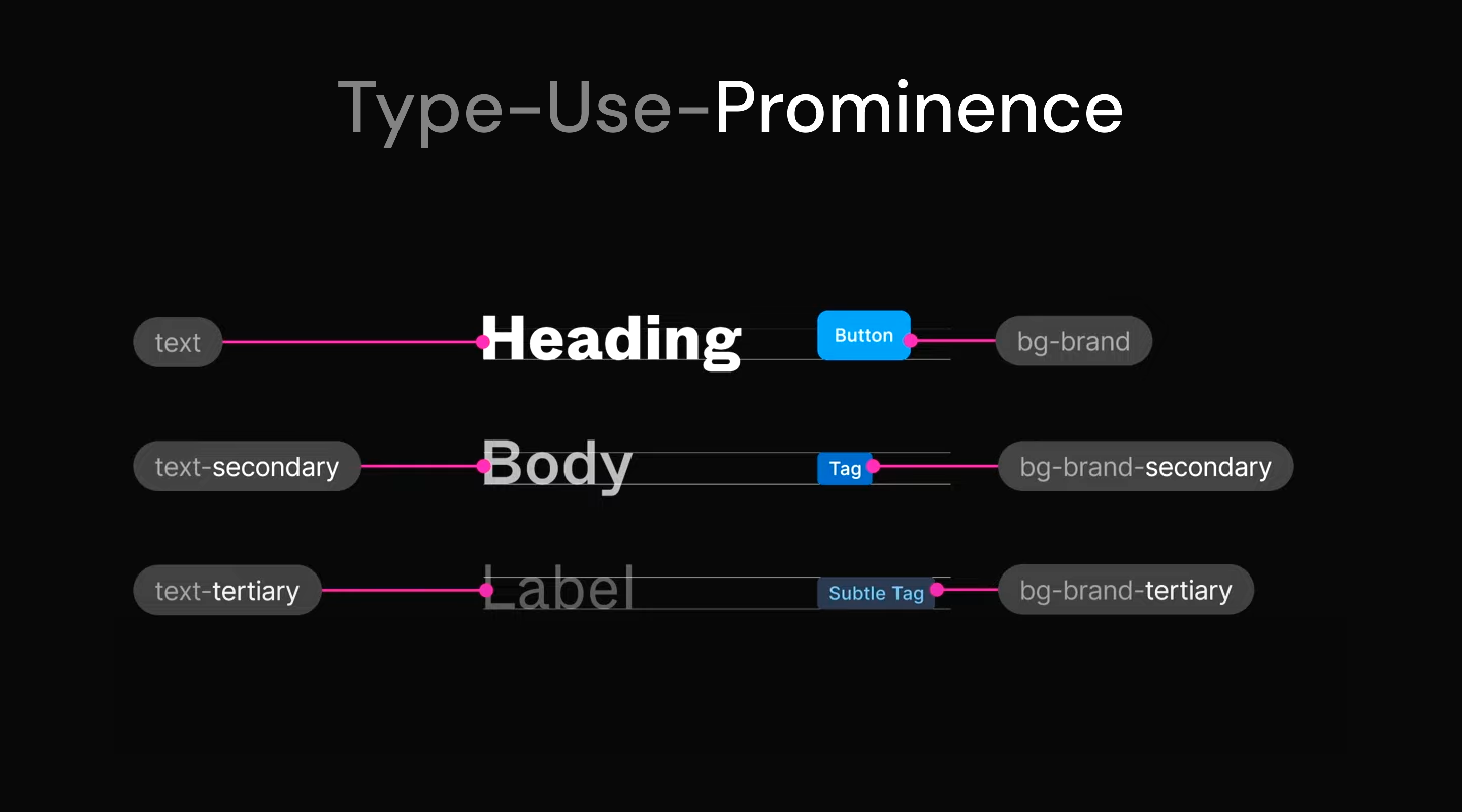
Color prominence (secondary, tertiary) gives specificity for color variables
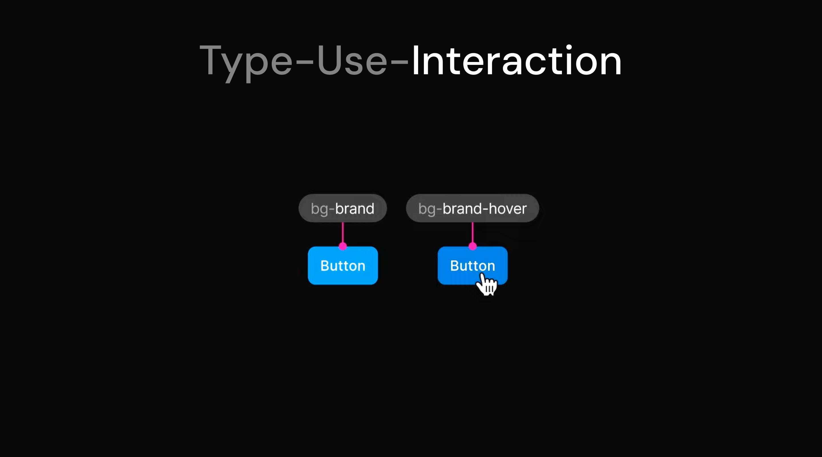
Interaction (default, hover, pressed, etc.) labels differentiate between interactive states
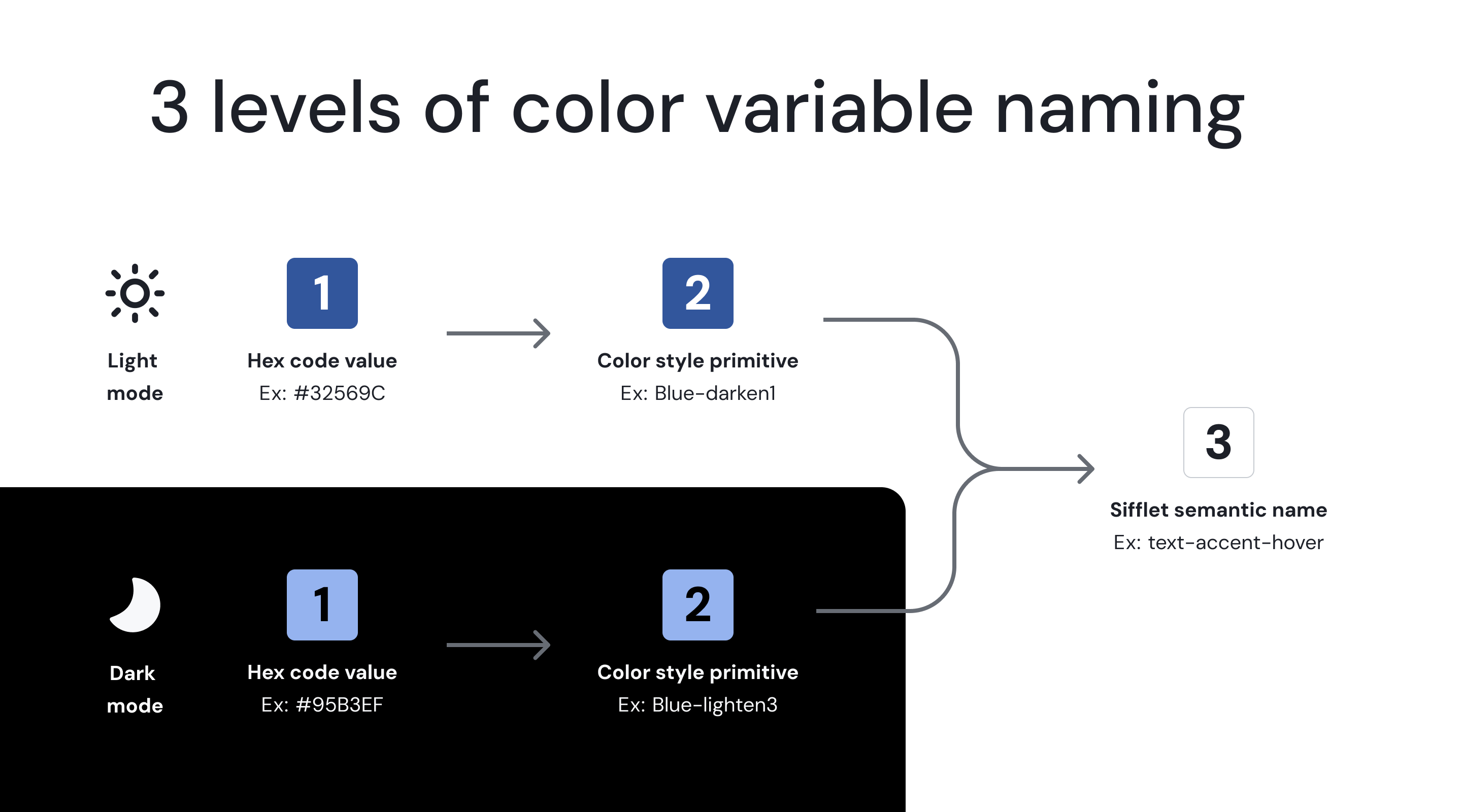
Colors have a root HEX value, a Vuetify color style primitive, and then ultimately a color variable that applies to different color themes.
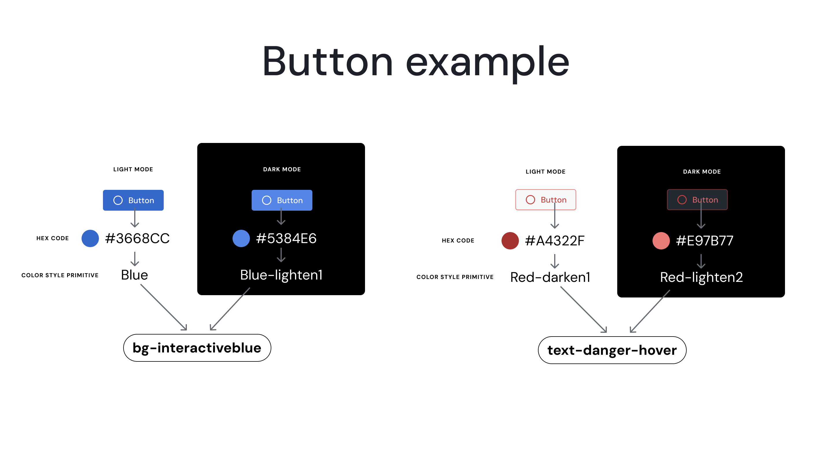
In these examples we see how a single color variable can represent different color values based on their theme.
Slide to Compare
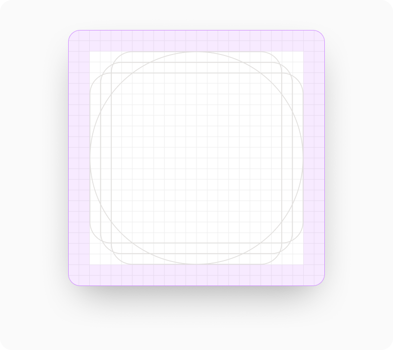
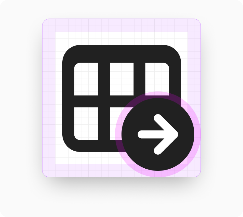
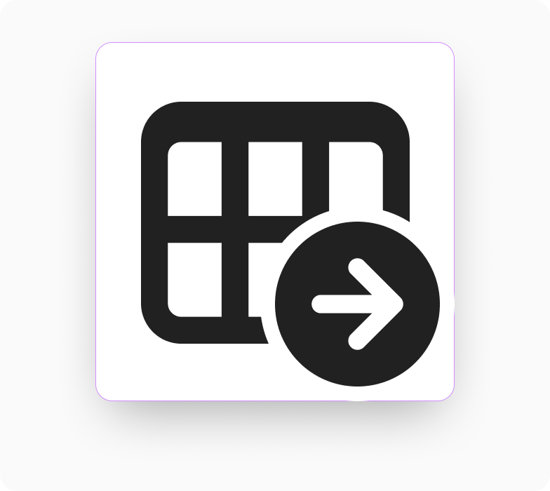
3. ⭐️ Iconography
The icons in Sifflet convey unique data concepts which requires a lot of custom design work. While the icon library uses some icons from the Microsoft Fluent system, I created well over 200 custom icons. To integrate these custom icons seamlessly into the UI, we created a dedicated icon font that is updated regularly.
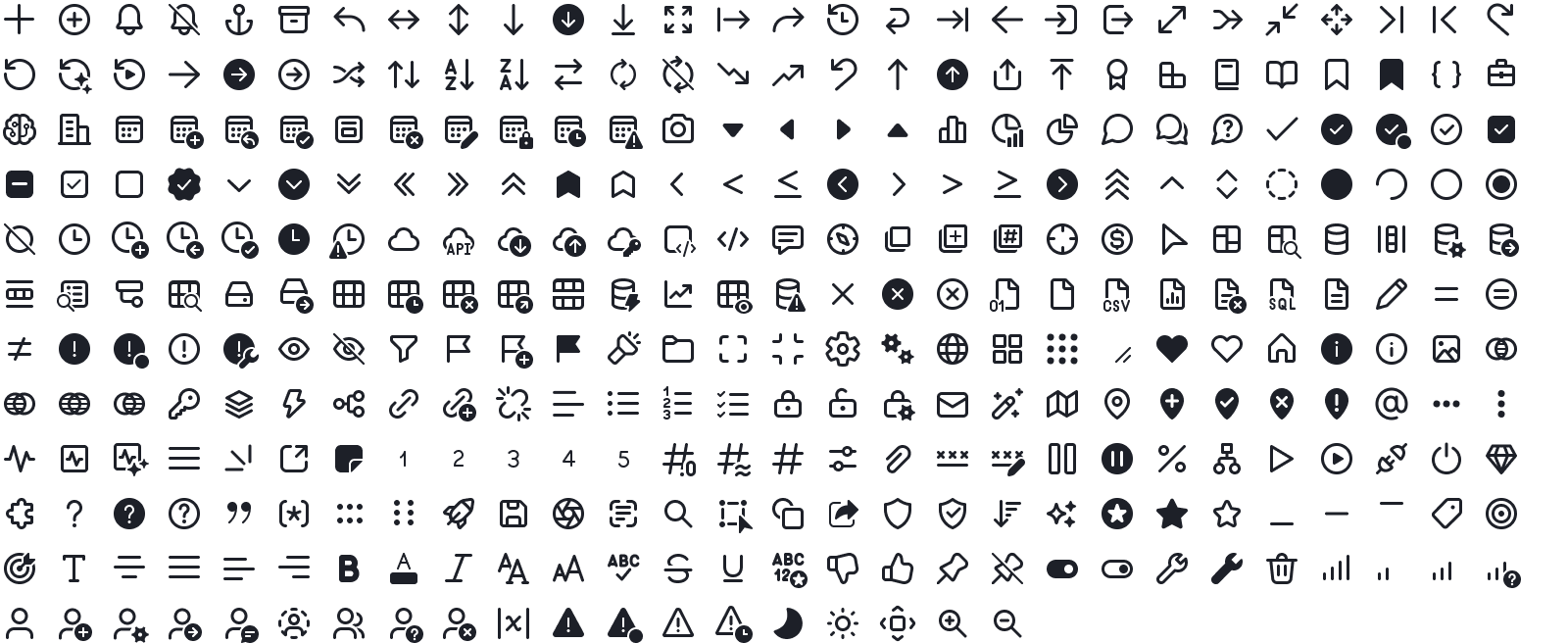
UX writing style guide
UX writing is crucial in creating a user-centered experience that helps Sifflet customers understand and interact with the product successfully. I created the writing guidelines to help my team of non-native english speakers understand the best practices for user-friendly language and to maintain a consistent voice.
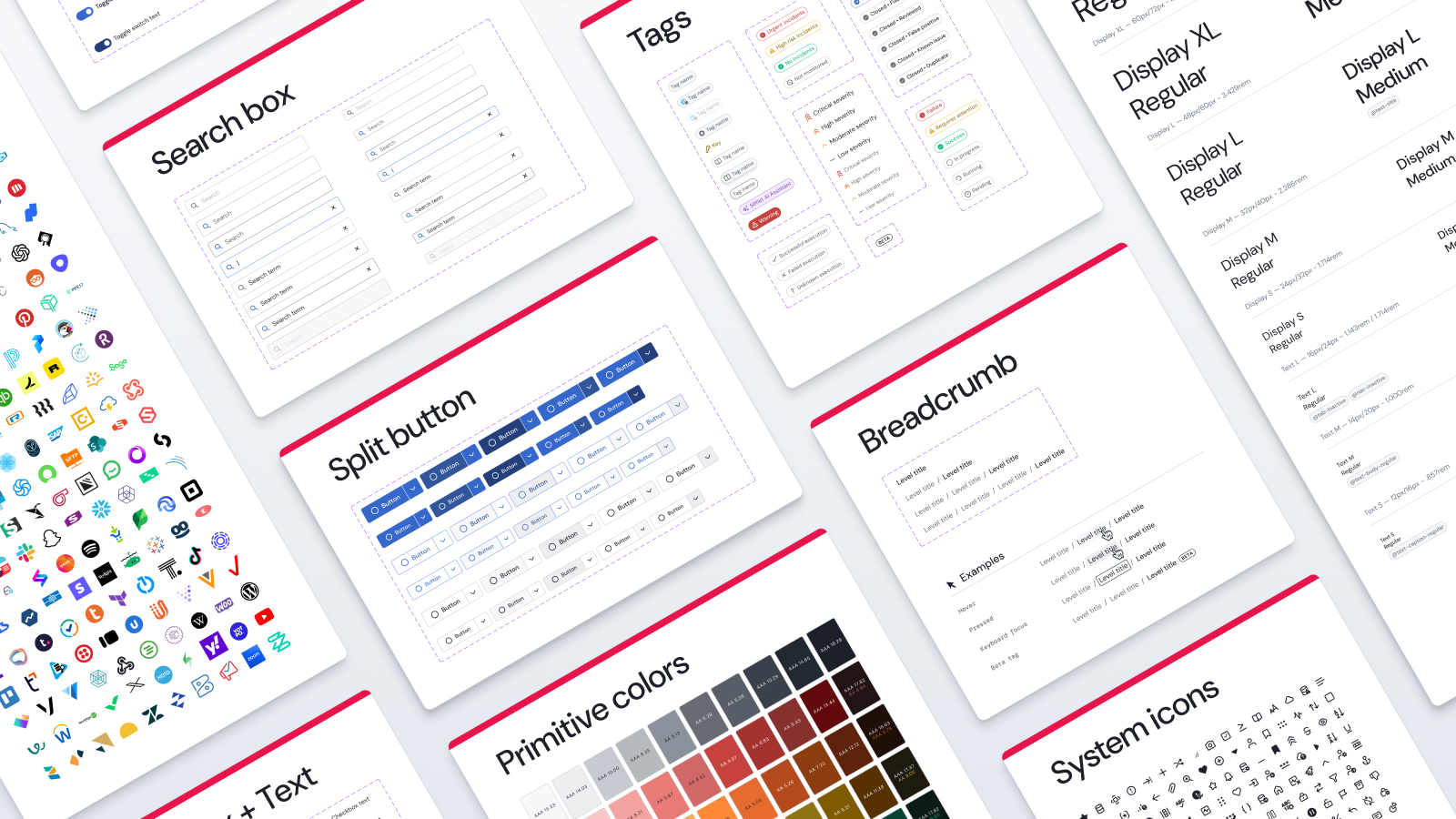
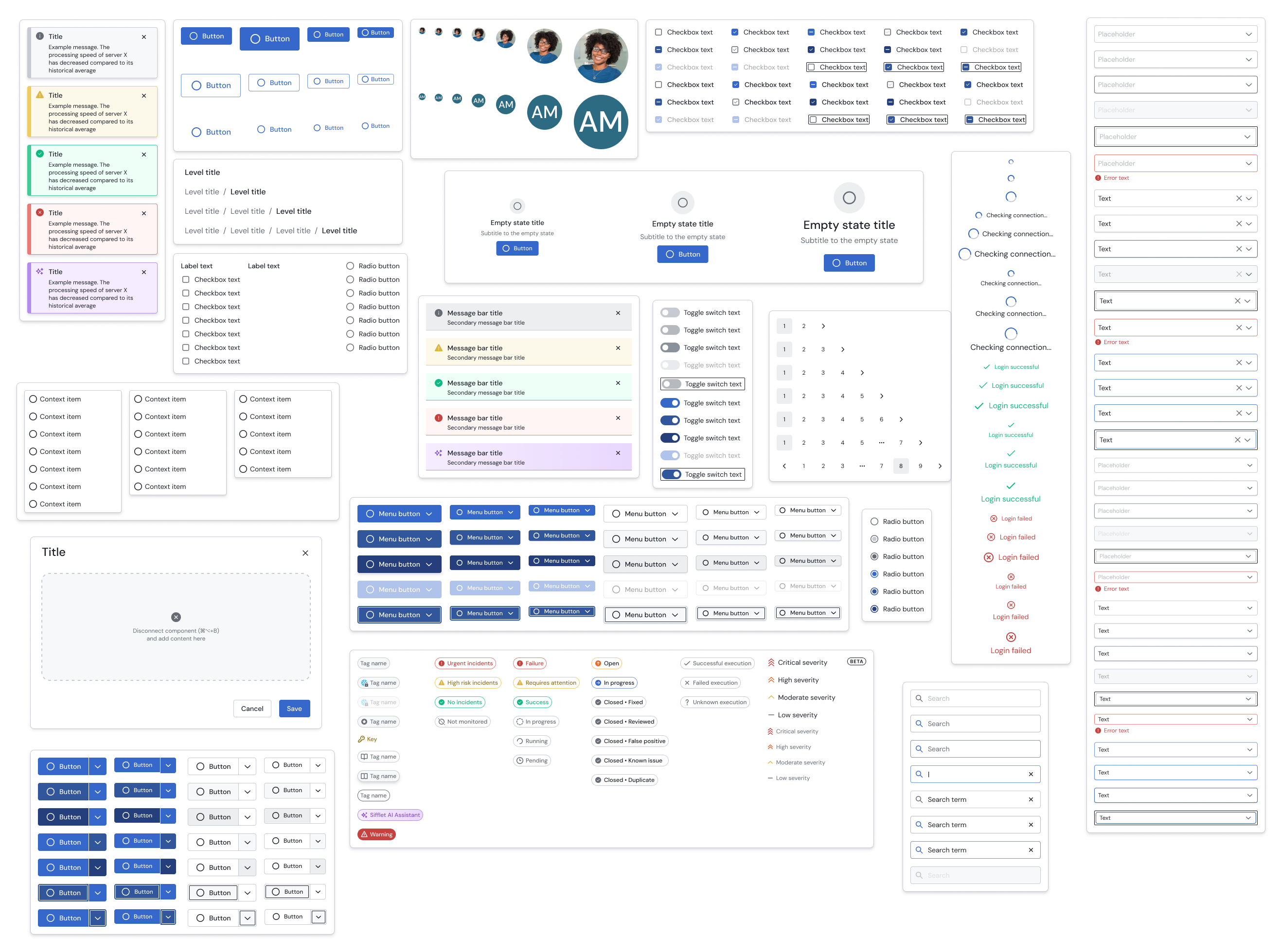
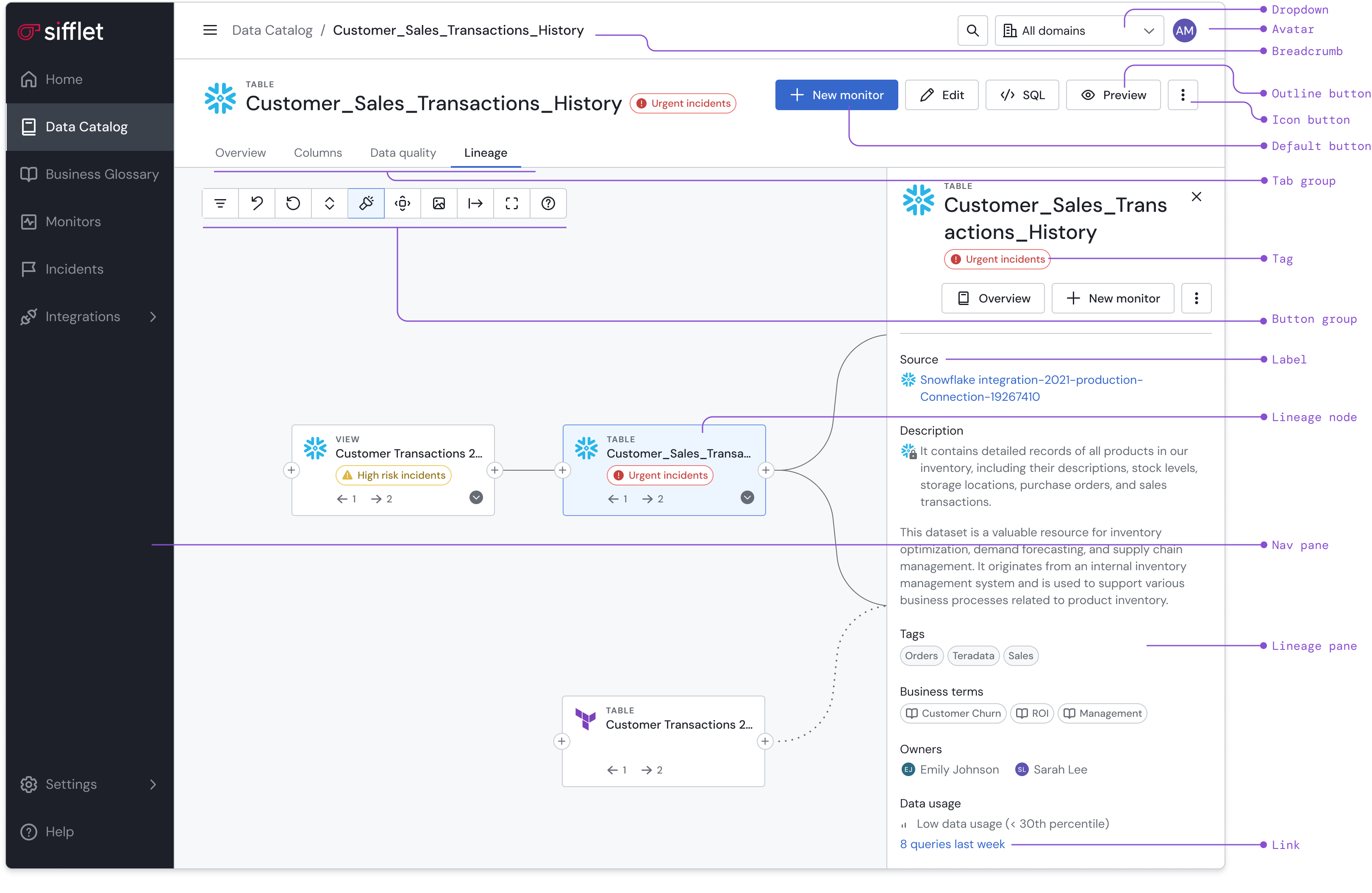
Components
Sifflet's interface is built using a library of small, reusable components that bring UI consistency and efficiency to all corners of the product. From foundational elements like buttons, labels, and input fields to more complex components such as navigation bars, modals, and side panels each component is designed to adapt seamlessly to a variety of uses.
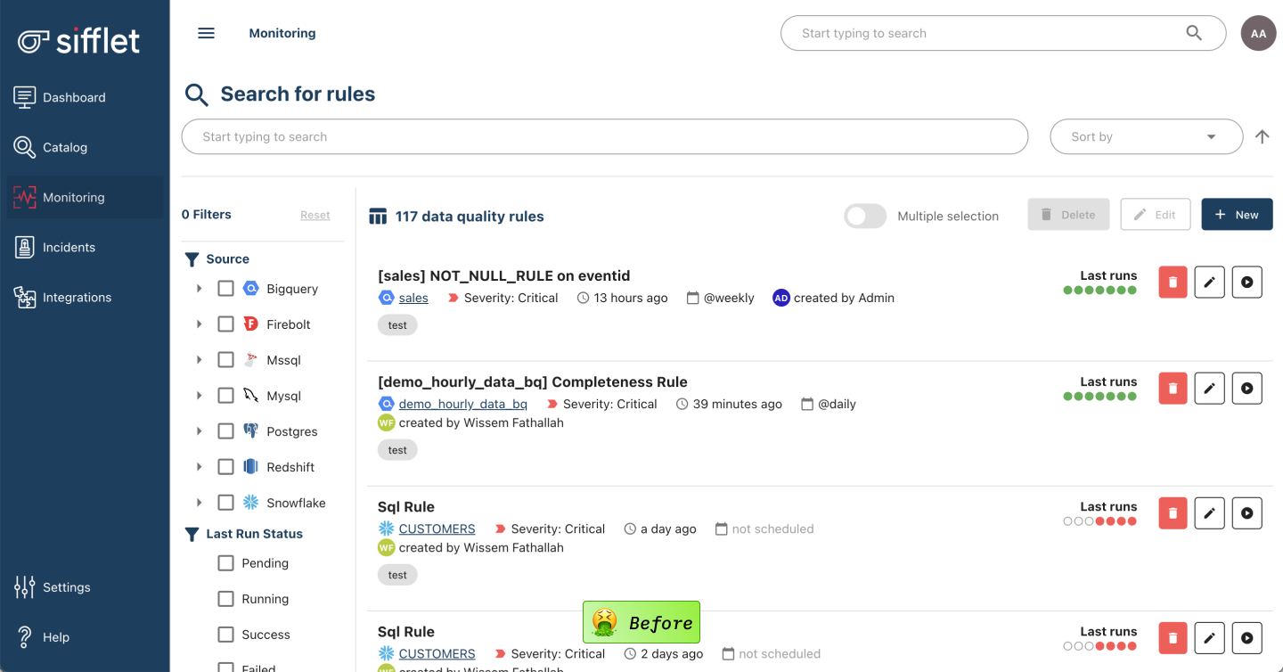
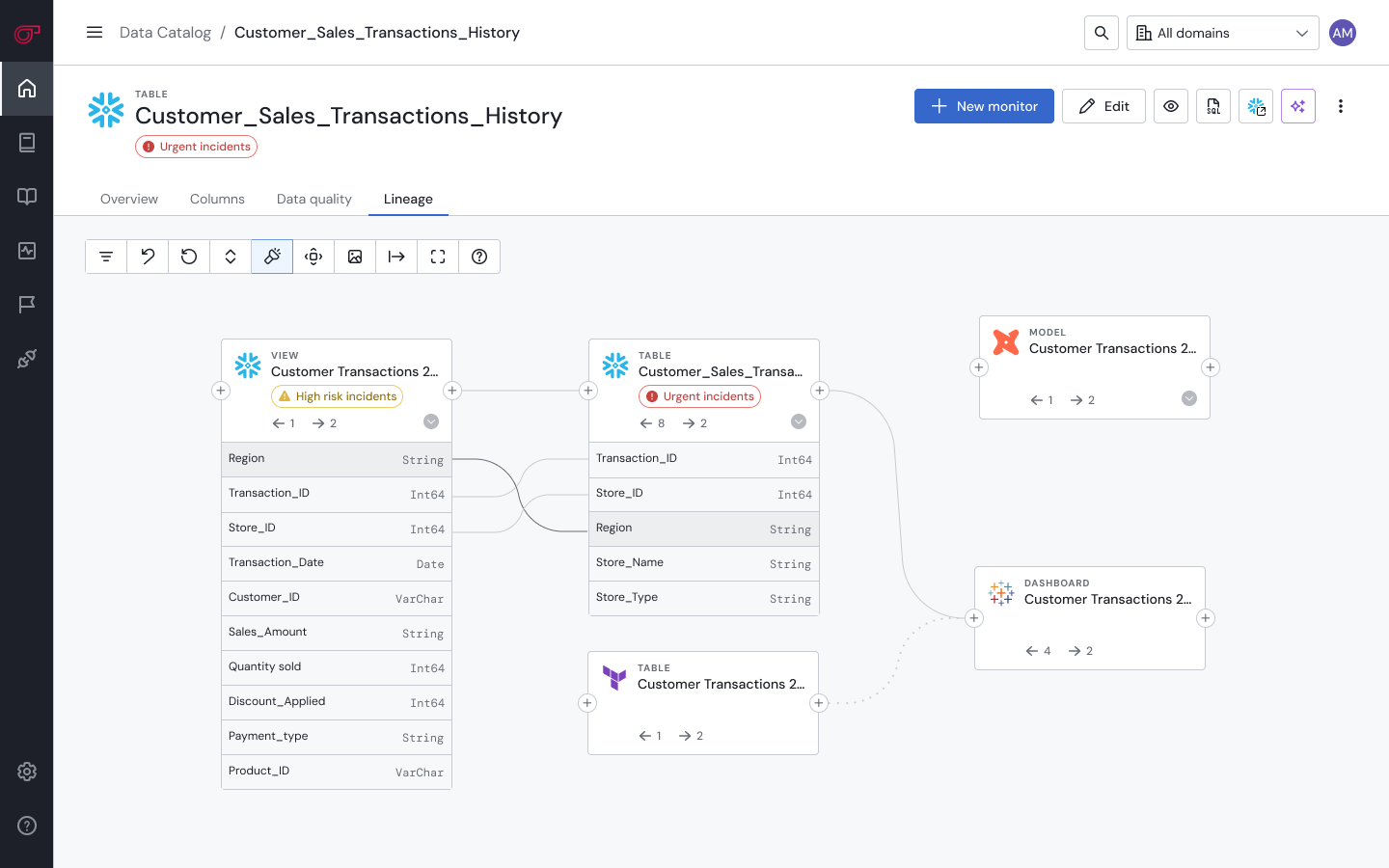
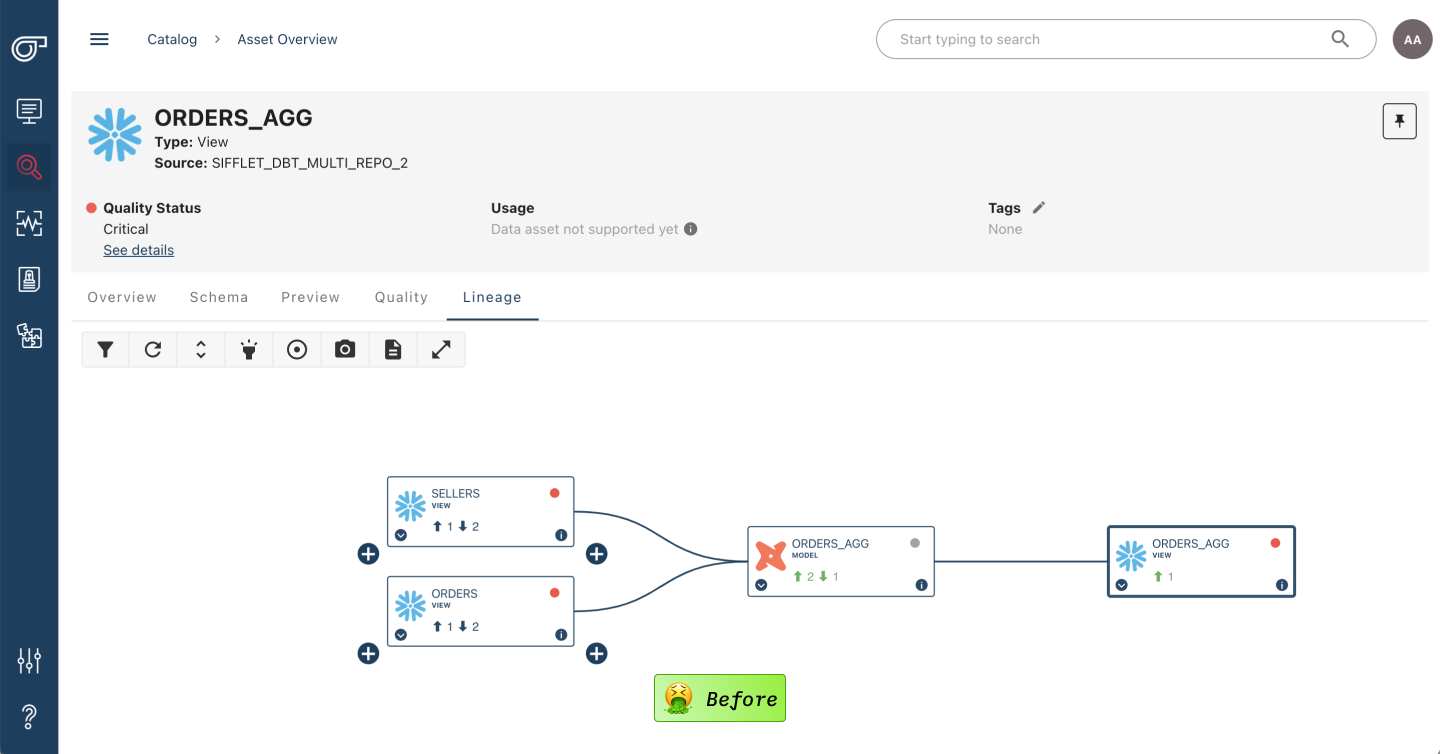
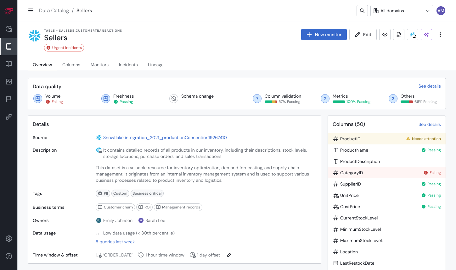
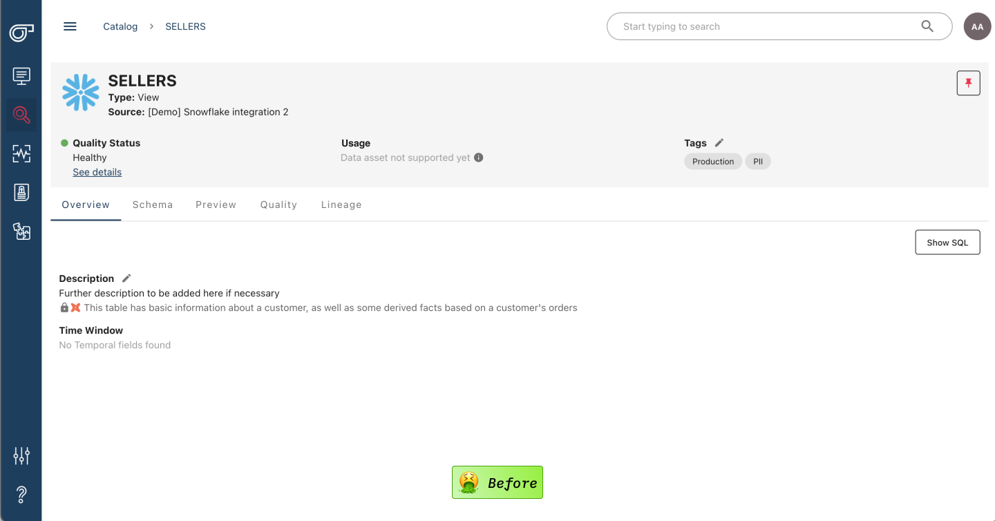
Full redesign
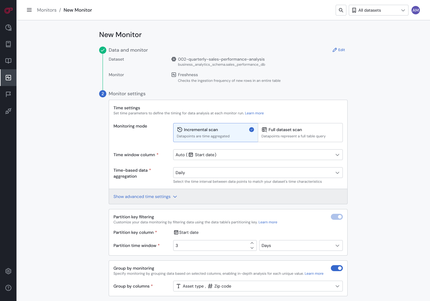
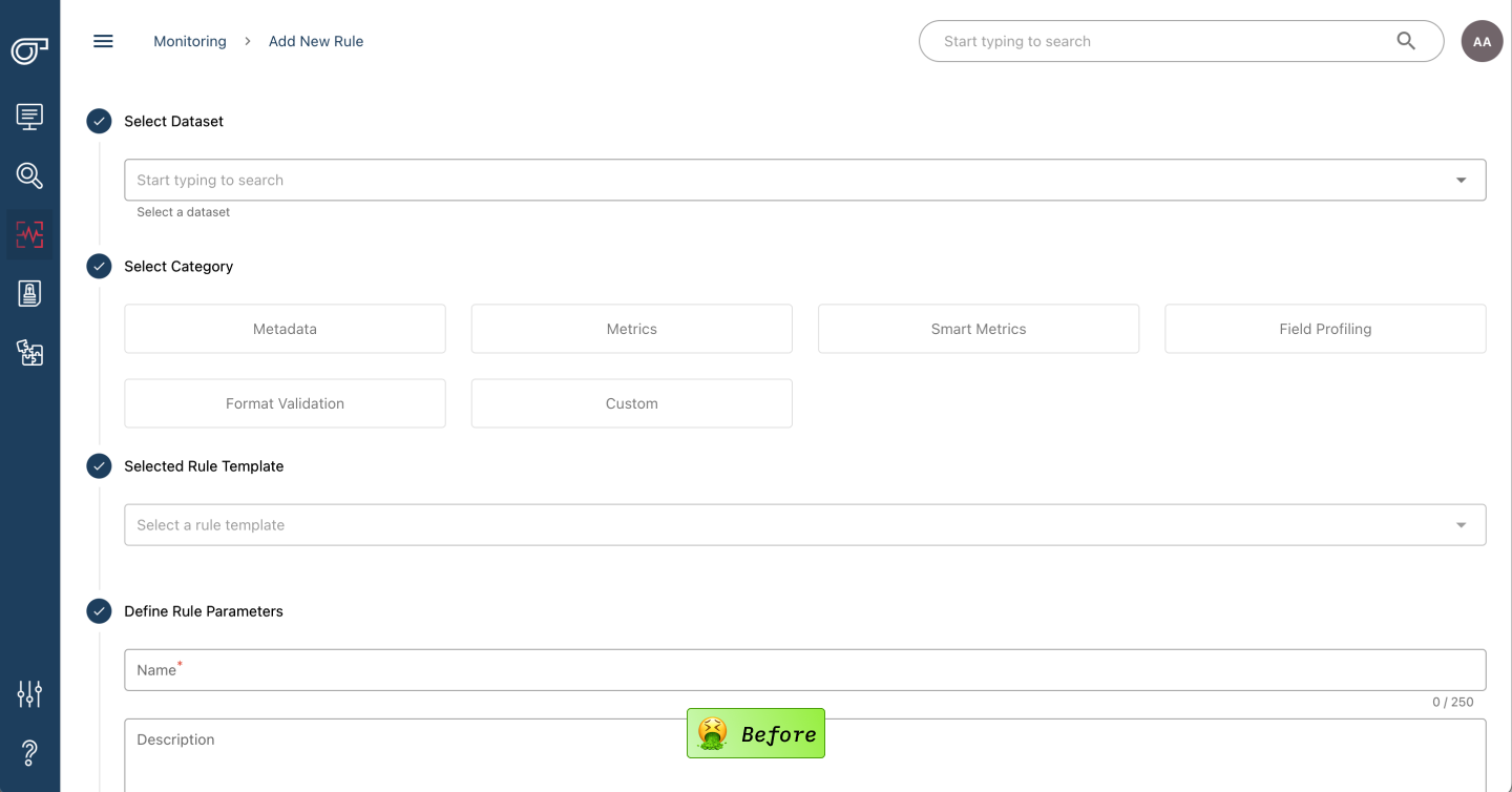
When I joined Sifflet, it faced significant design challenges across every page. I balanced the continuous delivery of new features with the overarching goal of redesigning the interface. The design system I created allowed us to ship features quickly while bringing a consistent design to the overall product.
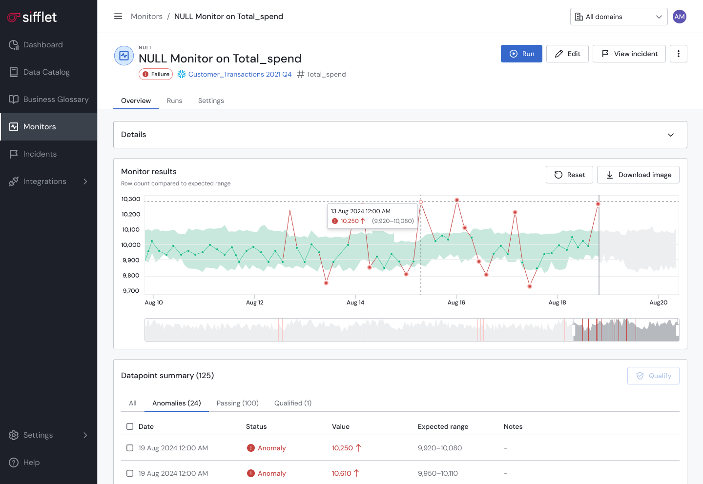
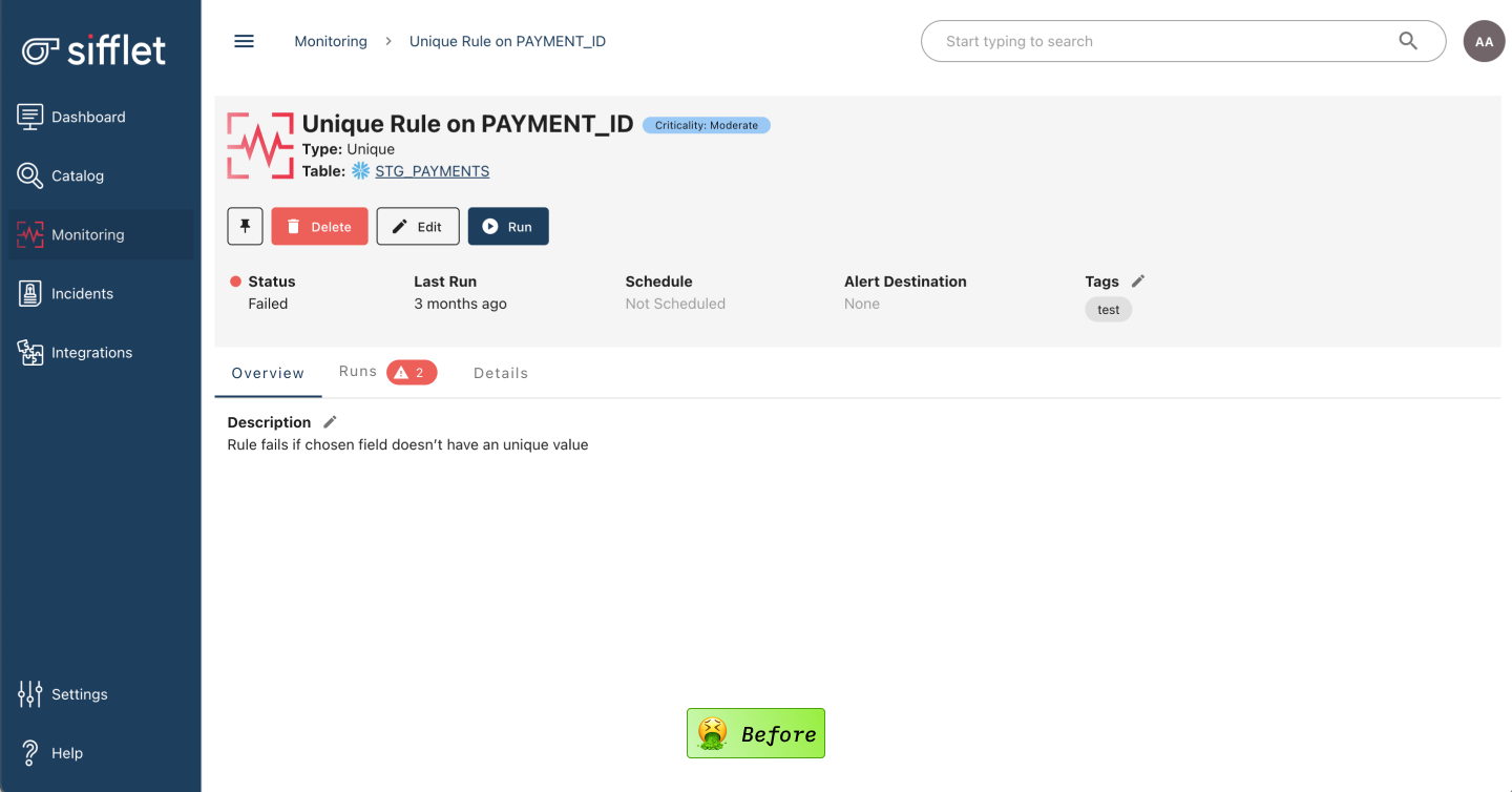
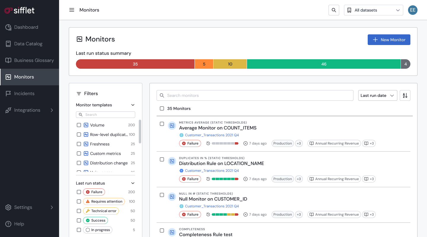
*** Click images to compare before/after
Click to compare before/after
Click to compare before/after
Click to compare before/after
Click to compare before/after
Click to compare before/after